7 Word Cloud Design Tips That Make Your Visuals Stand Out
Most word clouds look the same. These seven design tips covering fonts, colors, layout, and data preparation will help you create word clouds that are genuinely beautiful and effective.
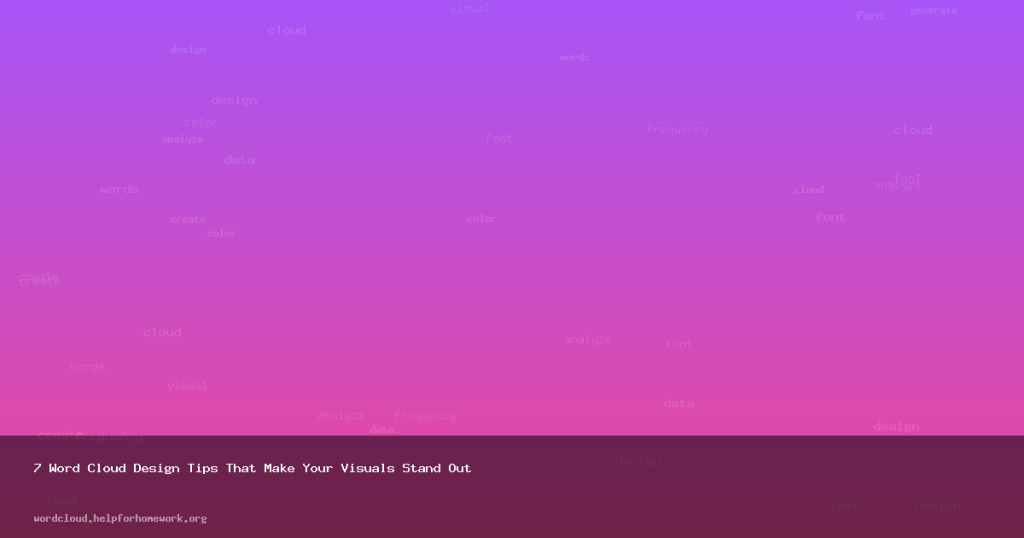
Most word clouds look generic — random colors, default fonts, too many words crammed together. They communicate data, but they don’t impress anyone. With a few deliberate design choices, you can create word clouds that are both informative and visually striking.
Here are seven design principles that separate amateur word clouds from professional ones.
1. Less Is More: Limit Your Word Count
The most common mistake is including too many words. A cloud with 200 words is noisy and unreadable — the small words at the edges add clutter without adding meaning.
The sweet spot is 30–60 words. This gives the dominant terms room to breathe while still showing enough variety to be interesting. Use the word count slider in our generator to dial in the right density for your content.
2. Choose a Font with Character
The default font is fine, but it’s forgettable. Your font choice sets the entire mood of the word cloud:
- Montserrat or Inter — Clean and modern. Great for business presentations and reports.
- Playfair Display — Elegant and editorial. Perfect for literary analysis or creative content.
- Permanent Marker — Casual and hand-drawn. Works well for classroom activities or fun social posts.
- Space Mono — Technical and precise. Ideal for developer or data-focused audiences.
- Bricolage Grotesque — Contemporary and distinctive. Stands out in portfolios and presentations.
The rule of thumb: match the font to your audience and context. A word cloud for a corporate board meeting needs a different font than one for an Instagram story.
3. Use an Intentional Color Palette
Random colors create visual chaos. A curated palette creates cohesion. Here are three approaches that always work:
- Monochromatic — Use 3–4 shades of the same hue (e.g., light blue, medium blue, dark blue). This creates a sophisticated, unified look.
- Analogous — Use colors that sit next to each other on the color wheel (e.g., blue + purple + pink). These harmonize naturally without clashing.
- High contrast — Use bold, saturated colors on a dark background (or dark colors on white). The contrast makes the cloud pop and ensures readability at any size.
Avoid using more than 5 colors — it starts looking like a ransom note. Our generator’s premade palettes are designed with these principles in mind, so they’re a safe starting point.
4. Set the Right Background
The background isn’t just empty space — it’s part of the design.
- White backgrounds work for documents, reports, and print materials.
- Dark backgrounds (charcoal, navy, black) make colorful words pop dramatically — great for presentations and social media.
- Transparent backgrounds give you maximum flexibility. Download as PNG with a transparent background and layer it onto any design in Canva, Figma, or PowerPoint.
5. Curate Your Word List
Don’t just dump raw text and accept whatever comes out. After generating your initial cloud, open the word editor and make intentional choices:
- Remove generic words that don’t add meaning (company names, common verbs)
- Remove near-duplicates (“run,” “running,” “runs” — pick one)
- Remove proper nouns that dominate but aren’t informative
A curated word list produces a more meaningful, cleaner visual than raw unfiltered text. Spend 60 seconds editing and the quality jumps dramatically.
6. Think About Context and Medium
Where will this word cloud be seen? Design accordingly:
- Presentation slide — Keep it large and simple. 30 words max. Use the SVG download for crisp rendering at any screen size.
- Social media post — Use bold colors and a dark background. Download at 2x resolution (our PNG export does this automatically).
- Printed report — Use high contrast, a professional font, and download as SVG for print-quality resolution.
- Blog or web page — PNG works great. Consider a transparent background so it blends with your page design.
7. Iterate, Don’t Settle
The first word cloud you generate is a draft, not the final product. Professional designers iterate. Try:
- Three different fonts — pick the one that feels right
- Two color palettes — compare them side by side
- Different word counts — see how the composition changes
- With and without stop words — sometimes including common words adds useful context
The entire process takes 2–3 minutes. The quality difference between a first draft and a polished version is enormous.
Put These Tips to Work
Open the Word Cloud Generator and try applying these principles to your next word cloud. Start with intentional colors, a carefully chosen font, and a curated word list. The result will be a visual that doesn’t just display data — it communicates it beautifully.